”home””about””blog””shop”

Thursday, January 31, 2013

HOW TO COMBINE MULTIPLE PICTURES IN ONE JPG FILE


As I mentioned yesterday, I was trying to figure out a way to quickly update my existing .com site using the tools that I had at my disposal.  In a series of short sited decisions, I chose to set the site up using wordpress.com instead of wordpress.org and as a result, my options were a little limited.  My first priority was to create some sort of slider to showcase several of my designs to display at the top of my site. I didn't have a slider plug in at my disposal, so I had to find a creative way to utilize the header instead.

In trying to solve my dilemma, I remembered a little Photoshop tutorial I ran across that helped me create the below for my Memphis City Guide post (found here).  
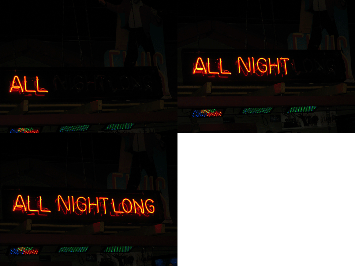


Now, I realize this baby is a little all over that place.  So if I used these same tools, I'd have to be much more purposeful in my design.  As Jess Lively would say, I would have to implement my design with intention.

I realized there would need to be a common theme to unite all the pictures so I came up with the idea of the category badge (custom personal stationery, birthday party invites, etc.)  This badge and a common picture height and width setting was all I needed to get started editing and creating my photo files.

Once I had all my photo files prepared, I went back to review Liz's (from Say Yes to Hoboken) wonderful tutorial - found here and I was off to the races. I'm super pleased with how it turned out, if I do say so myself.

Happy photo editing everyone!


Wednesday, January 30, 2013

BLOGGER VS. WORDPRESS

I've made it a priority for 2013 to build out a sad little project that I began in May 2012.  I'll admit, I was pretty short sited when I started this project as I was purely focused on the blog (my sweet little shop wasn't even a glimmer in my eye!).  Now, I have to rethink my plans and I wanted to share that process with you.

I was a newbie to blogging and was under the impression that the only way to have a .com blog (not a .blogspot.com one like I have now) was to use the blog templates from Wordpress.  This is completely untrue, you can actually use Blogger and for a small fee upgrade from a .blogspot to a .com).  Anyway, I went ahead and signed up for a Wordpress site, paid my fee, and voila! www.squareviewstudios.com was born. 

That's when things went a little wonky. When I went to write my first blog entry on my brand new site, I logged in and quickly ran away screaming with fright. Wordpress was a bit advanced for me in the spring of 2012.  Blogger was definitely more my speed.  As a result, my .com site sat there unused for months. 

When I opened the shop in October of 2012, I knew I needed to better utilize my .com site.  Honestly, that opened a Pandora's Box.  Should I convert my Blogger site to Wordpress?  Should I buy a theme or will one of the free ones work for my needs? Should I host on Wordpress.com or move to Wordpress.org?  The list goes on...

I'll address each of the decisions individually in future posts, but I wanted to share with you some perspective.  Blogger is great (and for the foreseeable future, my blog will remain where it is), but it has its limitations.  If you're looking for a personal blog platform, it can't be beat.  It's easy to understand and it's completely free.  But, if I had to do it all over again, knowing what I know now, Wordpress and specifically Wordpress.org, would have been my choice. 

With that said, I've found ways using the current tools via Wordpress.com to make progress on bringing my .com site back from the dead.

First stop, I created this custom slider to mimic the ones you find on other Wordpress themes.  It's not officially a slider, but it gets the job done for now.  I show you how I did it in tomorrow's post. Stay tuned! 


Tuesday, January 29, 2013

BEER + PANTONE = BEERTONE


                                                             Source: beertone.ch via Squareview on Pinterest


Be still my heart.  Two of my favorite things combined into one.  A Pantone color chart and beer!

You may recall that I'm a big fan of beer.  So when I saw this little beauty on the interwebs, I had to share (check out the site here). It is a common misconception out there that the lighter the color of beer the "lighter" the beer itself.  I wonder if you would find in interesting that a Bud Light and a Guinness have roughly the same calories and Bud Light has more carbs.  I kid you not.  I guess the message here is, if you are looking after your waistline, you're not  stuck with only watered down choices!

Ok, I'll get off my "life is too short to drink crap beer" soapbox now and get back to this nifty little guy. While it doesn't track things like calories or carbs, it does show the CMYK, RGB, HTML, and SRM (the official beer color scale) of each of the beers.  So fun!  What's even better is that they are still taking beer suggestions.  I'm thinking of submitting some selections from my favorite local brews.  Hmm, I wonder if they would do Mr. Squareview's recent home brew.  Off to find out.

Happy Tuesday all!

Monday, January 28, 2013

MUSIC MONDAY vol 36

I love movies.  All kinds.  I particularly like when I see one that I feel has a heart felt and original story.  That's how I felt this weekend when Mr. Squareview and I watched Salmon Fishing on the Yemen.  When you get down to it, it was basically a boy meets girl story but there was so much more than just that.  It was beautifully written and acted by two of my favs Ewan McGregor and Emily Blunt.  You may be asking - what does this have to do with Music Monday? The soundtrack of course!  This lovely number by The Young Romans was a great addition to the film.  Enjoy!


P.S. Another software update is messing with my view of embedded youtube videos.  If you're getting an error too - here is the direct link.

P.P.S I didn't say it above, but if you haven't yet seen this movie - rent it.  You will not be disappointed.

Friday, January 25, 2013

FREEBIE FRIDAY: VALENTINES GIFT TAGS

Can you believe that Valentine's Day is just around the corner?  I'm beginning to think I'm getting the winter blues so I wanted to snap myself out of it by making something pretty.

I mentioned earlier this week that I just wrapped up a new class from Nicole's Classes and as a result, I think I found my feminine side.  I wanted to share this new side with you so I made these pretty gift tags to share.

There is nothing better than getting a little token of love to celebrate the day, and wouldn't it be even more appealing with these tags attached?  I wish I would have had some time to photograph them for you, as they are just darling. The download link is below.  Happy Friday!

CLOSE UP VIEW OF TAG #1

CLOSE UP VIEW OF TAG #2


Thursday, January 24, 2013

ON THE ROAD AGAIN

Just landed in DC and this is my very bleak view. Yuck! Check back tomorrow for some fun Friday freebies!


Wednesday, January 23, 2013

I STILL HEART NICOLE'S CLASSES

I just wrapped up a fun two week course at Nicole's Classes (my go to place for all things Adobe Illustrator)  called Ornaments & Embellishments (find all the info about this class here).

My design style definitely leans towards the simple and unadorned but lately I was getting more requests from clients to include some, for the lack of a better term, "girly" elements to my designs.  I figured it was time to expand my tool kit and learn how to implement some more traditionally feminine design items, but to do it while staying true to my style.  Enter, the Ornaments & Embellishments class.  Among other things, we spent a ton of time working on different types of flower designs (something I had steered far clear of in the past) and I found that I actually liked it.

Here is a sneak peak of something I'm working on that includes my new found flower love....


Look out for an upcoming Freebie Friday for more details...

Tuesday, January 22, 2013

MARDI GRAS WREATH PROJECT


Happy Tuesday!  I've finally recovered for my cold and I'm back to my old self again.  That said, it is going to top out at 2 degrees in Chicago today, so my cold fighting abilities may be put to the test!

I took advantage of the long weekend and finished a project that Mr. Squareview has been begging me to do for over a year.  I custom ordered these beautiful pomanders for our wedding aisle decor and have been struggling to find a second life for them for the last 18 months. Mr. Squareview loves to organize (it boarders on obsession, really).  Half of that organization typically results in a major purge every few months so the fact that these "purple balls" have been taking up valuable storage space has been a point of discussion.  To prevent them being a causality of the purge, I had to find a new use for them so they wouldn't getting tossed.

You may have noticed in my previous posts (here, here and here) that I like me some wreath making, but a plain purple ball wreath just didn't float my crafty boat.  Exactly what would my poor door be celebrating?  So I brainstormed on purple and then it hit me - Mardi Gras! It's super early this year (Feb 12th) so it is definitely the right time to begin celebrating!


It's not my best work to date, but I think it turned out cute enough and I got to rescue some of my pomanders from the trash heap.   Happy Mardi Gras, Y'all!


Wednesday, January 16, 2013

CREATIVE LEADERSHIP

I'm still fighting this cold, so instead of posting something original, I'll share an interesting article I found on 99u.  I found it fascinating and really applicable to my job (the one the pays for my mortgage, not my fledgling little studio).  As my once small & entrepreneurial minded firm grows, I wonder if we're at risk to err on the side of hum drum.  Makes a girl think....

Illustration: Oscar Ramos Orozco found on 99u site

Two candidates are being interviewed for a leadership position in your company. Both have strong resumes, but while one seems to be bursting with new and daring ideas, the other comes across as decidedly less creative (though clearly still a smart cookie). Who gets the job? 

The answer, unfortunately, is usually the less creative candidate. This fact may or may not surprise you – you yourself may have been the creative candidate who got the shaft. But what you're probably wondering is, why?

Check out the entire article here.


Monday, January 14, 2013

MUSIC MONDAY vol

I'm a bit under the weather today and this song always perks me up, even with classic Morrissey malaise. Enjoy!

Friday, January 11, 2013

FRESHLY MINTED - CLASSROOM VALENTINE


I've got some great news to share today.  News that I've been sitting on since before Christmas and I can't tell you how tough it's been not to blab!  So here it goes - I am super pleased to announce that my design You Rock was picked as a winner for Minted's XOXO Valentine's Day Challenge and it is now available for sale! Yippee!

I've designed 3 different colorways for this classroom valentine.  Each are modern and bold.  Perfect for any little girl or boy to give to their classmates.  

You Rock Classroom Valentine's Day Cards
FIND IT HERE
You Rock Classroom Valentine's Day Cards
FIND IT HERE
You Rock Classroom Valentine's Day Cards


2013 is off to a great start, if I do say so myself.  Have a great weekend!

Wednesday, January 9, 2013

SQUAREVIEW STUDIOS IS ONE!


Source: myparadissi.com via Amanda on Pinterest


It was a year ago today that I posted my first entry to this little blog.  Oh how times have changed!  It's been an incredible year and I'd like to thank you for all the encouragement along the way!  

I'm so looking forward to the next 12 months and beyond.  Exciting things are in store for Squareview Studios!  Thanks for coming along for the ride! 


Tuesday, January 8, 2013

MODERN BIRTH ANNOUNCEMENTS

Voting is now open for the Hello Baby! Birth Announcement Challenge on Minted.  This crop of submissions is by far my favorite.  I love each and everyone of them (it helps that the subject matter in each si so darn cute!).  Which one is your favorite?

You've already seen "hi there"

birth announcements - Hi There


Here are the rest.  As always, if you like what you see, I would love your vote!  Also be sure to check out the other gorgeous submissions by the other Minties!


birth announcements - Rattle


birth announcements - Banner Baby


birth announcements - Gingham


birth announcements - Introduced by Infographic


Monday, January 7, 2013

MUSIC MONDAY vol 34

I heard this over the weekend and was reminded how much I liked this moody little number by Anna Ternheim.  Enjoy!


Friday, January 4, 2013

DESIGN TREND: TEXT OVER PHOTOS

If you have spent any time at all poking around on the blog-o-sphere you are well aware of the use of text over photos. It is used to diagram DIY steps, list favorite items in a product rundown, and showcase things in all manner of ways. Some folks use it in big bold ways and others are much more subtle.

In stationery design, I've seen and used text over photos for a while now.  It looks gorgeous when you have a full bleed photo (photo goes all the way to the edge and has no boarder) like in this save the date example below.


save the date cards - Track to Love

Recently, I've been spotting a update to this trend that I really like.  Instead of putting the text somewhere around the object of the photo's focus, the text is being placed smack dab on top of the photo's object of focus. 

I've seen it used where the opacity of the word is brought down so you can see the image through the words but I've also see it used where the word is full opaque. I was really inspired to try this out myself and figured Minted's current Hello Baby! Birth Announcement Challenge was the best place to give it a whirl.


What do you think? I liked the full opaque look paired with the light shade I used for both the typefaces. I loved how it turned out.  That said, I can't tell if I think the bottom is too heavy or not.  I may be in for a color change this weekend.

I've got several other submissions to share with you next week.  Until then, Happy Friday!!


Thursday, January 3, 2013

GOAL SETTING

Source: i.imgur.com via Ambur on Pinterest


I am back from a wonderfully relaxed New Years Eve getaway (more later on that later) and ready to hit the ground running.

I have so many ideas swirling around my noggin that it can get quickly overwhelming.  Once you allow yourself to feel overwhelmed, the paralysis of analysis kicks in and you end up going nowhere.

I know you've heard it a thousand times before (especially around this time of year), but the best way combat that paralysis is by putting together a game plan and to write it down.

With that in mind, this weekend I plan on taking stock in my little studio and putting pen to paper to figure out how I want 2013 to shake out. I'm so excited about being able to spend time on my plan and share it with you so stay tuned!