”home””about””blog””shop”

Friday, August 10, 2012

NICOLE'S CLASSES - WEEK 1


I'm so excited!  I started my first week of a 4 week class from Nicole's Classes.  What I'm a studying you may ask?  Why, Adobe Illustrator of course! 

The class started Monday and I'm totally behind because I was on the road all week.  I hope Mr. Squareview doesn't have any special plans for the weekend as I'll be knee deep in the courses because my homework is due Sunday night - oh boy, time to get to work!

Happy weekend everyone!


Thursday, August 9, 2012

Tuesday, August 7, 2012

MINTIE FRESH: NEW YEAR

It seems like there has been a flurry of Minted activity over here at Squareview Studios lately.  I'm not sure if that is just because I've been posting about them in a cluster or if the challenges themselves are being announced closer together.  Regardless, I've been enjoying my Minted time!

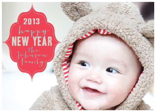
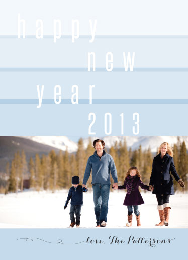
The newest challenge {which I don't believe is yet up for voting} is for New Year cards.  The procrastinator in me loves this challenge because I can definitely relate to folks who don't get their holiday cards out in time! New Year's wishes can be sent well into January and it doesn't make you look like a slacker.  Love it!

I'd love to hear what you think about these submissions!  {BTW - how cute is that kid??!?}

new year's cards - New Bear


new year's cards - new year line up

new year's cards - winter wonderland

Monday, August 6, 2012

MUSIC MONDAY vol 16

I ran across this local Chicago band called Fort Frances with the best cover I've heard for a long time.
Sorry no YouTube video, but you can listen to it here.  

And for old times sake, here's the original from 1991 (can you believe it's been that long?).  Still a great one.

Friday, August 3, 2012

BREW CAMP

Mr. Squareview and I are going to camp this weekend.  This camp is a tiny bit different than the sleep-away camps of my youth { mainly, because there is alcohol involved }.  What kind of camp is this, you ask?  Why it is Brew Camp!  

Mr. Squareview and I are going to learn how to brew our own beer at home.  You may recall from this post that we've always had a hankering for making our own beer.  I'm so excited to get started.  Stay tuned for postcards from camp!

Happy weekend everyone!

Awesome Info Graphic found here

Thursday, August 2, 2012

OMBRE LOVE


Pretty exciting news!  I finally figured out how to create a chevron pattern in illustrator.  I know.  Life. Changing. Stuff.

But seriously, it couldn't have been simpler.  I don't know why I struggled so much originally.  This pen tool thingy is amazing!  Ok, enough about my current obsession {adobe illustrator and all of its wonder} and back to chevron patterns.

My friend asked me to help her put together an invite for her husband's birthday party and I was playing around with some concepts.  He's right up there with Dos Equis - The Most Interesting Man in the World so I had to keep it pretty masculine.

I thought blue chevron would look awesome so I put a pattern together.  We decided to go in a different direction instead {more on that soon} but I couldn't let my efforts go to waste.

I took my pattern and kicked it up a notch and ombre'd it up.  Oh, how I love me some ombre.  So much so that I took a little walk through the interwebs to pull some of my fav blue ombre images.  Lovely.

Photo Credits: Top - cake from prudent baby,  dress,  flowers from Martha   chair from design sponge
Bottom - tub via Living Etc, stairs from Martha, mug from Christine & Co, hair - couldn't get past tumblr to find source.

Wednesday, August 1, 2012

MINTIE FRESH - LOLLIPOPS AND SUCH

My day job has been a bit of challenge lately so only a quick post today to share two last minute entries to the latest Minted challenge.  

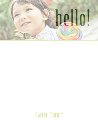
I tend to avoid using the photos for my entries but decided to switch it up when I saw this cutie in the line-up of photos offered.  I had just been experimenting with a technique that removed the lettering from the background to create a deboss effect.  I love how "hello!" lets the photo show through.  Unfortunately, I didn't notice until after the submission deadline that the color I used for the name Garrett Turner wasn't dark enough { I've been trying to be a little more subtle in my color choices and I guess I went a little too far! } 


   personal stationery - Hello Lollipop

For the second entry, I wanted to experiment with two different fonts that intertwined.  Historically, for names and headings I've always used the same font.  Keeping with my theme of switching it up, I thought it would be fun to use two different fonts.  Again, I wished I would have had a little more time to adjust the color of the boarder as it is just a little too light.  Oh, well. Live and learn.   I'd love to hear your thoughts!  


personal stationery - Trellis Blue