Monday, April 30, 2012
MUSIC MONDAYS vol FOUR
Very quick post today but I had to share the Color Theory love... Such a fun song to "beat" (Ha! I'm so punny J) away the Monday blues. Enjoy!
Friday, April 27, 2012
FABULOUS FONT FOCUS on FRIDAY
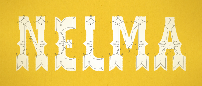
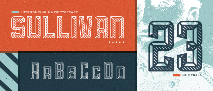
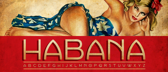
I've been obsessed with fonts lately. I just can't get enough. I've mentioned this before, but it is amazing how much typography and the fonts used within the design impact the overall look. Beautiful fonts make me happy, inexpensive beautiful fonts make me drool.
If you've pursued the interwebs a bit you may have run across other Font Fridays from folks much more committed than I. They say that plagiarism is the highest form of flattery, so I'm launching my (likely one time only) Font Friday! Woo Hoo!
My list is focused on one of my favorite spots for font goodness, The Lost Type Co-Op. If you've interested in great fonts and you've never heard of them you must check them out!
Here are a few of my faves... Enjoy!
 |
| get it here |
 |
| get it here |
 |
| get it here |
 |
| get it here |
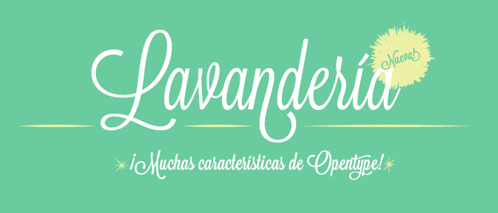
I've posted it before but you can't reference Lost Type without mentioning it. This font has become a favorite script for many designers out there. One of my favorites for sure! So many opentype options! just gorgeous!
 |
| get it here |
Brief background:
The Lost Type Co-Op is a Pay-What-You-Want Type foundry, the first of its kind. Founded by Riley Cran and Tyler Galpin, originally in a whirlwind 24 hour adventure to distribute a single typeface, Lost Type has blossomed into a full fledged foundry, distributing fonts from designers all over the world, with its unique model. Users have the opportunity to pay whatever they like for a font, you can even type in '$0' for a free download. 100% of funds from these sales go directly to the designers of the fonts, respectively. Lost Type takes no cut of sales, and holds no funds.
Happy weekend!
Thursday, April 26, 2012
ON THE ROAD, AGAIN - SO GLAD I FOUND THE POCKET APP!
Another quick day trip today. Client visit in Minneapolis. Day trips that keep me in the same time zone are my absolute favorites.
This morning, while trying to catch up on my twitter feed before boarding my flight, I ran across an interview posted by oh my! handmade goodness. The topic was broadly about organization but what really caught my eye was the discussion on an app called pocket (formally called read it later - find it here).
I was immediately intrigued with the concept and could NOT believe I hadn't discovered this little gem earlier! If you aren't yet familiar, this app will let you bookmark web articles, pics, blog posts, etc. and put them in your "pocket" for consumption later - even without an Internet connection! Perfect for a gal like me that spends her fair share of time in the air.
I spent the hour before my flight home putting no less than 19 articles and blog posts in my "pocket". I'm not sure if you are familiar with the flight time between Minneapolis and Chicago - but it's short. Super short. Like 48 mins today short. I was just a bit over prepared ;)
I guess that just means I'm sorted for my next trip.
I took these snaps in flight to share (after some instagram goodness was applied). Enjoy!
Wednesday, April 25, 2012
THANKS A MILLION DESIGN CHALLENGE!
You guessed it - it's time for another Minted challenge! I've been focusing on patterns for these new designs. This latest Minted challenge is called 'thanks a million' and is asking for thank you card designs. I'm still putting the finishing touches on these, but I wanted to share a few things I've come up with so far. I've got about 5 more design days to tweak these babies before they are due.
Along with the patterns below, I'm trying to tackle a chevron pattern... I can't tell you how hard that stupid little zig zag has been for me to get right.
I'd love to hear what you think about my progress so far. Enjoy!
Along with the patterns below, I'm trying to tackle a chevron pattern... I can't tell you how hard that stupid little zig zag has been for me to get right.
I'd love to hear what you think about my progress so far. Enjoy!
Monday, April 23, 2012
MUSIC MONDAYS vol THREE
Love Matt & Kim! While this may be an "oldie" it is definitely a goody and worth sharing.
A Brief history from our friends at YouTube....
A Brief history from our friends at YouTube....
Matt and Kim is an indie rock duo residing in Brooklyn, New
York, formed in 2004 by Matt Johnson (vocals/keyboards) and Kim Schifino
(drums/vocals). The two met while attending the Pratt Institute in Brooklyn and
started playing local warehouse shows in Brooklyn. Their simple, dance style
rhythms and energetic performances have gained them a substantial local
following and a formidable online presence through social networking and media
sites like YouTube and MySpace. The group released their first full-length,
self-titled CD on record label and media group "Iheartcomix", in
October, 2006. Matt & Kim played at the Siren Music Festival, a free music
concert held in Brooklyn, on Coney Island, and at Chicago's Lollapalooza in
2007. They have appeared on MTV2 as program hosts. Their music video for
"Yea, Yeah" has also been shown on the station, and the video for
"5K" has been shown on MTV Europe but was said to be too violent for
the US. Their second album Grand was released on January 20, 2009 on Fader
Label. They have a DIY attitude towards their music. They also have a
wide-ranging musical taste, including top 40 hip hop. They will be performing
at the Pitchfork Music Festival in Chicago this year. Recently, their hit song
"Daylight" was featured in a Bacardi commercial.
5, 4, 3, 2, 1....
Thursday, April 19, 2012
ON THE ROAD AGAIN...
In Philly today visiting clients for work. Long day - up at 4am and was at the airport early. So early in fact, that I had to take this pic. O'Hare is never this empty - I needed proof!
I spent my day talking to my clients about investing, the markets, and what products we should offer to their investment advisors. Serious stuff, I know. Except half way through, I realized that I was thinking that the conference room wall art would make a cute graphic for the thank you card I'm designing for the latest Minted challenge. Seriously... I'm obsessed ;)
I spent my day talking to my clients about investing, the markets, and what products we should offer to their investment advisors. Serious stuff, I know. Except half way through, I realized that I was thinking that the conference room wall art would make a cute graphic for the thank you card I'm designing for the latest Minted challenge. Seriously... I'm obsessed ;)
Wednesday, April 18, 2012
POSTING SOCIAL MEDIA ICONS ON BLOGGER...TAKE TWELVE cont.
Yesterday, I promised that I would share a step by step tutorial on how to post these lovely little buttons on blogger. I'm a visual learner so I thought I would map it our with pictures... Enjoy!
First create a Photobucket (or something similar) account. It's free! Save all the images of you social media buttons there. You'll ultimately link to that site to get the image you show as your button.
After you save your images, take the following steps:
First create a Photobucket (or something similar) account. It's free! Save all the images of you social media buttons there. You'll ultimately link to that site to get the image you show as your button.
After you save your images, take the following steps:
- Go to layout on your blogger dashboard
- Choose to add a gadget
- Choose the HTML/Java Script option and click the + sign
4. Once you open up the gadget you change the choice to edit the HTML. You can cut and paste the below HTML code (I recommend doing in a word doc so you can play around with it for each button you create (i.e. FB, RSS, Twitter, Pinterest, etc.) for use. The blue and red below is where you will put your customized info.
<ahref="https://www.facebook.com/pages/your fb page name/xxxxxxxxxxxx"><img style="width: 87px; height: 81px;" src="http://ixxxx.photobucket.com/albums/xxx/your image name/facebookfinal-1.jpg" height="26" /></a>
5. The blue will be a simple cut and paste of your custom FB (or Twitter, RSS, Pinterest, etc.) page's URL. I kept messing up because I deleted the " " marks. Don't do that J
For the red - you go to your Photobucket account. Copy the Direct Link HTML script and paste it in between the " ".
Now lather, rise, and repeat for the other social media buttons. Don't be fooled by my confusing pics above, I realized too late that the HTML says FB while the Photobucket page shows Pinterest... You're all smart cookies, you get the point!
Hope this was helpful. Happy posting!Tuesday, April 17, 2012
POSTING SOCIAL MEDIA ICONS ON BLOGGER...TAKE TWELVE
If you've been paying really close attention, you may have noticed that I've been modifying the social media icon buttons you see just at the right. I'm brand new to all this so I was thrilled when I actually managed to post the first versions AND get them to work. Whew, that was a challenge and there are surprisingly few tutorials for blogger (at least that I could find) out there. More on that later....
Not one to be easily satisfied, I quickly got bored with the first versions as they were just too plain. Back to the drawing board. The second versions we just not crisp enough, the third (which never even had their timein the sun on the blog) were just downright ugly, the forth.... Well, you get the picture. I just wasn't happy. I also had a terrible case of design envy from the other sites I was seeing out there. The last versions that I just removed today were the standard icons for each of the four sites with no customization and I was quickly growing tired of those too.
I've been an absolute nut for fonts lately (which has been pretty heavily documented via my Pinterest Pins J) and ran across this website that designed a font of social media icon buttons! Simply type a 'L' and the little twitter bird appears like magic. And, just like any font, you can customize the color. I spent way too much time today posting the blue versions and now I think I like the red better. What's a girl to do? What do you think...
Not one to be easily satisfied, I quickly got bored with the first versions as they were just too plain. Back to the drawing board. The second versions we just not crisp enough, the third (which never even had their time
I've been an absolute nut for fonts lately (which has been pretty heavily documented via my Pinterest Pins J) and ran across this website that designed a font of social media icon buttons! Simply type a 'L' and the little twitter bird appears like magic. And, just like any font, you can customize the color. I spent way too much time today posting the blue versions and now I think I like the red better. What's a girl to do? What do you think...
BLUE flr&OR RED flr&?
Blue is going to have to do, at least for now. Tomorrow's post will share all the behind the scenes details on how to get these funny little things to work in the hopes that nobody else will have to live through all the head scratching and hair pulling I went through!
Hope you get a chance to check out all the other SquareView Studios goodies on FB, Twitter, & Pinterest. Happy Clicking to you all!
Monday, April 16, 2012
MUSIC MONDAY vol TWO
I love The Temper Trap and when I found this video I just had to share it. It is quirky and fun (just like the band).
It may be because I'm a child of the 80's but I just love it when music videos go that extra mile and choose to tell a story instead of just random images. And, if the story is based in the 80's it is even better!
This one paints a picture of what followed after Johnny failed to sweep the Karate Kid's leg during the big karate competition. So clever and the guy playing Mr. Miyagi can really nod a head J Enjoy!
Friday, April 13, 2012
CORPORATE HOLIDAY CARD SUBMISSIONS FOR MINTED
It's been a couple weeks since I've mentioned a Minted challenge (I think that is definitely a record for me!), but it is time to break the streak. I mentioned in a previous post that the most recent challenge was asking for corporate holiday cards designs. As you may recall, I was working under a pretty tight time frame as my trial period for Adobe Illustrator was coming to a close. As a result, I ended up doing something completely out of character - I turned in my "homework" early!
My lack of procrastination allowed me to experience something I hadn't during previous submissions. This time, I was able to receive feedback from my fellow Minted designers on my submissions in time to take them into consideration and apply them before the submission deadline. They gave me some invaluable feedback and as a result I tweaked some of my original designs. I said it before but this time I mean it even more so, I think these are my best results yet.
I wanted to send a big THANK YOU to my fellow Minties for your encouragement and suggestions! I'd love to hear what you think of the new upgrades. If you are interested in comparing the final designs with my originals you can see the originals here. Have a great weekend!
My lack of procrastination allowed me to experience something I hadn't during previous submissions. This time, I was able to receive feedback from my fellow Minted designers on my submissions in time to take them into consideration and apply them before the submission deadline. They gave me some invaluable feedback and as a result I tweaked some of my original designs. I said it before but this time I mean it even more so, I think these are my best results yet.
My original design for Soft Snowflake had a the snow flake itself touching the top, right, & left sides of the card. It was suggested that I utilize the negative space better and reduce the size. I thought it made such a difference!
Another suggestion was tiny but had a huge impact. In my original Snow Day design used the same 'm' I used above in Soft Snowflake. The combination of the line flourish book-ending the 'happy holidays from' and that extra glyph in the 'm' was just too much. It was suggested that I find an alternate glyph to use instead. After fiddling with Adobe Illustrator for a while, I figured it out and I think makes a world of difference!
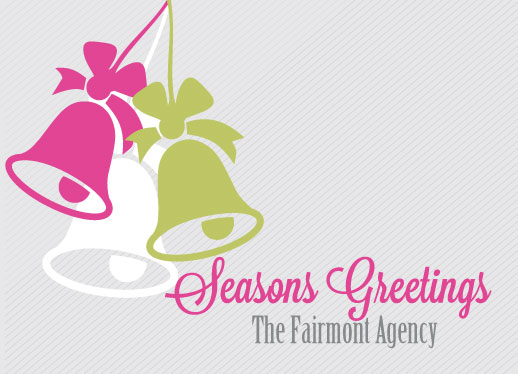
In the original design for Jingle Bells I used a green for one of the jingle bells that got lost against the grey striped background. I received a suggestion to make it pop more, but also was given the advice that the color shouldn't compete with the bold fuchsia color I used. I decided to mute the grey stripes and pump up the green only a bit and got these results. By muting the background, the company name ended up popping more as well.
I didn't receive any feedback on my Tree Swirls design but it didn't seem fair to leave it out of the make-over extravaganza J. I did a complete overhaul of the color scheme as the red and green combo just wasn't working for me anymore. Instead, I kept it tonal and I think it adds a level of sophistication to the design.
I wanted to send a big THANK YOU to my fellow Minties for your encouragement and suggestions! I'd love to hear what you think of the new upgrades. If you are interested in comparing the final designs with my originals you can see the originals here. Have a great weekend!
Thursday, April 12, 2012
CAN'T GET ENOUGH OF YELLOW AND GREY ROOMS
We decided to redecorate our guest bedroom and probably like most of America decided that we loved the combination of yellow and grey. I was looking for what seemed like an eternity for some bold and modern pillows to cap off the bed and wasn't finding anything. Mr. Squareveiw even joined in the hunt! Luckily, old faithful (aka Etsy) came to the rescue! I found these gorgeous (and totally affordable) pillows at The Lacey Placey. They arrived quickly and very well made. We absolutely loved how they turned out. Don't you?
Prior to putting the final touches on our room, we went in search of inspiration. It's amazing how the combination of these two colors can evoke such dramatically different moods. The combination of pale yellow and dove grey can lend a softness to any room whereas a concrete grey and bright yellow (like my new beautiful pillows!) add a modern touch.
There are so many gorgeous rooms out there using this fabulous color combination - I just had to share a few.
Enjoy!
Wednesday, April 11, 2012
IMAGES OF HOPE
On my way home after another client meeting and had to share the view from their offices in downtown Manhattan. The conference room looked directly over the site of Ground Zero. I thought the view was worth sharing. Simply remarkable.
Tuesday, April 10, 2012
BOSTON TODAY
Traveling again for my day job and found myself enjoying a beautiful day in Beantown today. I literally dropped in for only a couple hours for a quick client meeting and had to take a quick snap that highlighted the wonderful sunshine. My client flew in from Puerto Rico for the meeting... While this sun is sure beautiful, next time we're meeting at his office!
Monday, April 9, 2012
MUSIC MONDAYS volume ONE
Hope everyone had a wonderful holiday weekend! Mr. Squareview and I had a busy one enjoying ourselves with family and friends. We love getting together with everyone and wish we did it more often.
I thought I'd try out something new to start off the week. Music Mondays! During the drive to and from my Mom's house this weekend we put away the iPod and had the radio playing the entire time. During a particular stretch of road, this song was playing on no less than 4 radio stations. I hadn't heard it in several months and it reminded me how much I liked it. Enjoy!
I thought I'd try out something new to start off the week. Music Mondays! During the drive to and from my Mom's house this weekend we put away the iPod and had the radio playing the entire time. During a particular stretch of road, this song was playing on no less than 4 radio stations. I hadn't heard it in several months and it reminded me how much I liked it. Enjoy!
Thursday, April 5, 2012
OPENING DAY AT WRIGLEY FIELD
Today was the Chicago Cubs opening day at Wrigley Field. There is something so magical about this day. It is full of so much hope and promise. So much, you can almost taste it. For longtime Cubs fans like me, we wake up on this day and envision the possibilities. We are winners and the season is our oyster. Players will excel, coaches will lead, management will make the right decisions, and games will be won.
The score today was Cubs 1, Washington Nationals 2.
oh well...J
Wednesday, April 4, 2012
STAY CREATIVE, SAN DIEGO...
I'm up to my eyeballs in responsibilities for my "real" job so only a quick post today. I ran across this list a few weeks ago and I have kept thinking about it since then. So much so that I wanted it close at hand so it now resides comfortably in one of my Pinterest boards. I particularly like #24. Can't beat clever.
To paraphrase Ron Burgundy - You stayclassy creative, San Diego....
To paraphrase Ron Burgundy - You stay
Tuesday, April 3, 2012
TANGERINE TANGO FEVER
As I was walking around downtown Chicago today, I think I saw Pantone's 2012 color of the year displayed in almost every single storefront window. Macy's, Nordstrom's, Burberry, Coach & Brooks Brothers I get. Crate & Barrel, Sephora, Cole Hann, The Art of Shaving, and Walgreen's were a bit of a surprise! I knew that by being named in both Pantone's spring and fall 2012 color lists (and then the it color of 2012), Tangerine Tango would be hot, but it is literally everywhere.
I conducted a tiny experiment, I typed this color into Pinterest it took me all of 3 minutes to come across the beauties below. Gorgeous!
I conducted a tiny experiment, I typed this color into Pinterest it took me all of 3 minutes to come across the beauties below. Gorgeous!
I
think this one sums it up the best. Love Tangerine Tango!
I may need to renew my vows because if it looked anything like this vision board it would be fabulous!
Monday, April 2, 2012
LOVE ETSY ONLINE LABS
It may appear to others (to Mr. Squareview in particular), that jumping in head first without looking back is my default setting. Not true. I'm the type of person who likes to educate myself before making any decisions or changes in my life. That said, once I do the X amount of research that is appropriate for me, I don't linger or falter before pulling the trigger. My Mom tells the story that when I was a little girl there was a specific process to the way I gathered information. I would ask a question, she would answer, and then I would begin the "why" game. There could be as little as one follow up "why" or dozens but the common theme would be I was relentless until I received an answer that satisfied me. However, after that answer was given, I was off to the races.
My Mom has been released from duty as my resident information source, the interwebs are my go to now. I've mentioned a couple times now that I've been peculating on an idea for several weeks now... If I'm being honest, the idea has been forming for over a year, but the way in which I plan to execute the idea has really just come together over the last month or so. More to come on that soon.
What I really wanted to highlight today was that Etsy never ceases to amaze me. It doesn't stop at the plethora of gorgeous shops they "host" but there is an entire world behind the curtain that I'm slowly discovering. My most recent joy - the online labs. I cannot say enough about them. Superb! I spent many hours this weekend perusing all the helpful sessions and learned a ton. I recommend you take a look if you have ever thought - hey, I love crafting - maybe I can see what Etsy can do for me!
Enjoy
Sunday, April 1, 2012
HAPPY APRIL FOOLS DAY!
I found this brief history on this site & I thought would be fun to share. Enjoy!
The history of April Fool's Day or All Fool's Day is uncertain, but the current thinking is that it began around 1582 in France with the reform of the calendar under Charles IX. The Gregorian Calendar was introduced, and New Year's Day was moved from March 25 - April 1 (new year's week) to January 1.

In Scotland, for instance, April Fool's Day is devoted to spoofs involving the buttocks and as such is called Taily Day. The butts of these jokes are known as April 'Gowk', another name for cuckoo bird. The origins of the "Kick Me" sign can be traced back to the Scottish observance.
In England, jokes are played only in the morning. Fools are called 'gobs' or 'gobby' and the victim of a joke is called a 'noodle.' It was considered back luck to play a practical joke on someone after noon.
In Rome, the holiday is known as Festival of Hilaria, celebrating the resurrection of the god Attis, is on March 25 and is also referred to as "Roman Laughing Day."
In Portugal, April Fool's Day falls on the Sunday and Monday before lent. In this celebration, many people throw flour at their friends.
The Huli Festival is celebrated on March 31 in India. People play jokes on one another and smear colors on one another celebrating the arrival of Spring.
So, no matter where you happen to be in the world on April 1, don't be surprised if April fools fall playfully upon you.
The history of April Fool's Day or All Fool's Day is uncertain, but the current thinking is that it began around 1582 in France with the reform of the calendar under Charles IX. The Gregorian Calendar was introduced, and New Year's Day was moved from March 25 - April 1 (new year's week) to January 1.
Communication traveled slowly in those days and some people were only informed of the change several years later. Still others, who were more rebellious refused to acknowledge the change and continued to celebrate on the last day of the former celebration, April 1. These people were labeled "fools" by the general populace, were subject to ridicule and sent on "fool errands," sent invitations to nonexistent parties and had other practical jokes played upon them. The butts of these pranks became known as a "poisson d'avril" or "April fish" because a young naive fish is easily caught. In addition, one common practice was to hook a paper fish on the back of someone as a joke. This harassment evolved over time and a custom of prank-playing continue on the first day of April. This tradition eventually spread elsewhere like to Britain and Scotland in the 18th century and was introduced to the American colonies by the English and the French. Because of this spread to other countries, April Fool's Day has taken on an international flavor with each country celebrating the holiday in its own way.

In Scotland, for instance, April Fool's Day is devoted to spoofs involving the buttocks and as such is called Taily Day. The butts of these jokes are known as April 'Gowk', another name for cuckoo bird. The origins of the "Kick Me" sign can be traced back to the Scottish observance.
In England, jokes are played only in the morning. Fools are called 'gobs' or 'gobby' and the victim of a joke is called a 'noodle.' It was considered back luck to play a practical joke on someone after noon.
In Rome, the holiday is known as Festival of Hilaria, celebrating the resurrection of the god Attis, is on March 25 and is also referred to as "Roman Laughing Day."
In Portugal, April Fool's Day falls on the Sunday and Monday before lent. In this celebration, many people throw flour at their friends.
The Huli Festival is celebrated on March 31 in India. People play jokes on one another and smear colors on one another celebrating the arrival of Spring.
So, no matter where you happen to be in the world on April 1, don't be surprised if April fools fall playfully upon you.
Subscribe to:
Posts (Atom)


