My lack of procrastination allowed me to experience something I hadn't during previous submissions. This time, I was able to receive feedback from my fellow Minted designers on my submissions in time to take them into consideration and apply them before the submission deadline. They gave me some invaluable feedback and as a result I tweaked some of my original designs. I said it before but this time I mean it even more so, I think these are my best results yet.
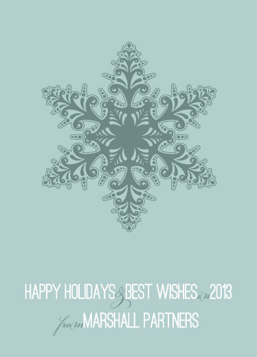
My original design for Soft Snowflake had a the snow flake itself touching the top, right, & left sides of the card. It was suggested that I utilize the negative space better and reduce the size. I thought it made such a difference!
Another suggestion was tiny but had a huge impact. In my original Snow Day design used the same 'm' I used above in Soft Snowflake. The combination of the line flourish book-ending the 'happy holidays from' and that extra glyph in the 'm' was just too much. It was suggested that I find an alternate glyph to use instead. After fiddling with Adobe Illustrator for a while, I figured it out and I think makes a world of difference!
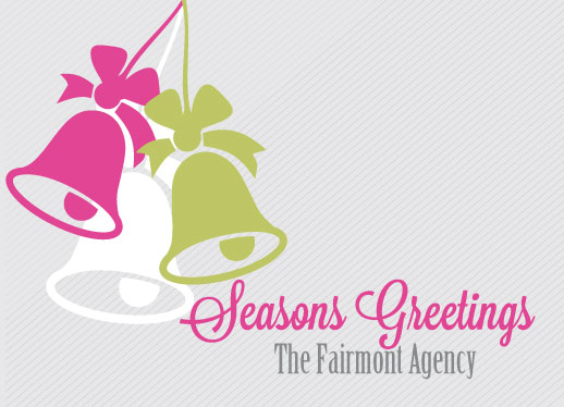
In the original design for Jingle Bells I used a green for one of the jingle bells that got lost against the grey striped background. I received a suggestion to make it pop more, but also was given the advice that the color shouldn't compete with the bold fuchsia color I used. I decided to mute the grey stripes and pump up the green only a bit and got these results. By muting the background, the company name ended up popping more as well.
I didn't receive any feedback on my Tree Swirls design but it didn't seem fair to leave it out of the make-over extravaganza J. I did a complete overhaul of the color scheme as the red and green combo just wasn't working for me anymore. Instead, I kept it tonal and I think it adds a level of sophistication to the design.
I wanted to send a big THANK YOU to my fellow Minties for your encouragement and suggestions! I'd love to hear what you think of the new upgrades. If you are interested in comparing the final designs with my originals you can see the originals here. Have a great weekend!


No comments:
Post a Comment