


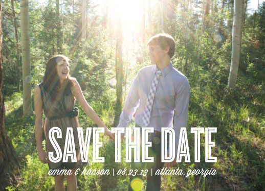
In stationery design, I've seen and used text over photos for a while now. It looks gorgeous when you have a full bleed photo (photo goes all the way to the edge and has no boarder) like in this save the date example below.
Recently, I've been spotting a update to this trend that I really like. Instead of putting the text somewhere around the object of the photo's focus, the text is being placed smack dab on top of the photo's object of focus.
I've seen it used where the opacity of the word is brought down so you can see the image through the words but I've also see it used where the word is full opaque. I was really inspired to try this out myself and figured Minted's current Hello Baby! Birth Announcement Challenge was the best place to give it a whirl.
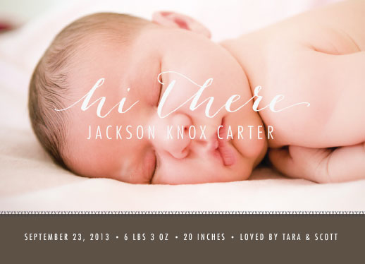
What do you think? I liked the full opaque look paired with the light shade I used for both the typefaces. I loved how it turned out. That said, I can't tell if I think the bottom is too heavy or not. I may be in for a color change this weekend.
I've got several other submissions to share with you next week. Until then, Happy Friday!!
No comments:
Post a Comment